


How to Design Your Brand Color Scheme (Without a Designer)

This blog is dedicated to helping you make sense of all those fluffy marketing terms you hear on Instagram and figure out what they actually mean for your business. Step-by-step guides, platform breakdowns, client case studies, and deep dives into the stuff that actually helps you grow.
XO Catie

You know what’s wild?
I’ve watched dozens of entrepreneurs spend an hour on Coolors.co hitting the spacebar like it’s a slot machine, only to screenshot something that looks fine, save it to their desktop as the latest version of their brand color scheme… and then six months later they’re still staring at a blank Canva screen wondering what the hell to actually do with those five little circles.
The palette looked good in theory. But every time you try to design something, it feels… off. The colors only work in a couple of combinations together. Nothing pops the way you wanted. You end up defaulting to black text on white background because at least that works.
Color generators create combinations based on algorithms, not your aesthetic.
They don’t know about the vintage film photos you save at 2 AM, or that coffee shop in Portland with the sage green walls you think about every time you design something, or the exact dusty purple that shows up in every sunset vacation photo you’ve ever taken.
Your brand colors shouldn’t come from a random AI powered generator. They should come from you—from the images, textures, and moments that already define how you see the world.
And more importantly? You need to understand why your colors work together, not just have five hex codes and a prayer.
In this blog post i’ll walk you through the exact method I use when designing brand color palettes for clients— so you can stop wasting time and money trying to figure out your brand colors and start building brand recognition for a color palette that is unique to you.
Why Brand Color Generators Fail You (And It’s Not Your Fault)
When you use a color generator it chooses colors based on contrast and creating analogous or complimentary combinations.
Here’s what you don’t get:
- Any connection to your actual brand story or personal aesthetic
- An understanding of how to use each color (Which one goes where? Can I use this as background? Will my text be readable on this?)
- A hierarchy (Which color will you use the most often? Which is the accent?)
- Confidence that this palette will actually work when you try to design your next Instagram post – or dare I say website.
Most brand color advice focuses on Color Psychology. “Blue conveys trust!” Okay, cool. But which blue? The electric blue that feels techy? The navy that reads corporate? The dusty blue-grey that feels vintage?
Different colors mean different things to different people and are also viewed differently by every single human eye.
So color pyschology gets you a whole lot of nowhere when you begin to decide what colors to use in your brand in the first place.
The Vision Board Method: Pull Brand Colors From Your Actual Life & Aesthetic
Your brand color palette is sitting in your screenshots folder because it was never actually yours. It was an algorithm’s best guess based on color theory rules that don’t account for your specific aesthetic, your brand story, or how you actually want to feel when you show up.
The vision board method changes that. You’re pulling from sources that already define how you see the world—and then learning to organize those brand colors in a way that actually functions across all your marketing.
No more refresh-refresh-screenshot-regret cycle.
No more “good enough” palettes that you’re lowkey embarrassed by.
No more finding new colors every time you open Canva that you eyeball as close enough to what you think your brand colors are.
Here’s how I actually build brand color schemes for clients—and how you can do it yourself:
Start with your camera roll, Pinterest saves, favorite spaces, and travel photos. Look for patterns and colors you’re naturally drawn to.
Include at least 6-8 images. So you have a variety of tones and colors to work with.
How to Extract Your Brand Color Scheme
Open Canva and upload your 6-8 vision board images.
Use Canva’s color picker tool—click on the little dropper icon, then click directly on a color in your image. Boom. You just extracted the exact hex code.
Do this for every color that makes you go “ooh.” You’ll probably pull 15-20 colors initially. That’s fine. We’re editing down later.
Here’s the part most people skip (and why their brand color palettes fail):
Organize your color pulls by saturation level and value, not just by hue. Group your lights together, your darks together, your brights together. This helps you see if you’re missing crucial contrast ranges.
You don’t need to memorize the color wheel or stress about whether you’re using triadic or tetradic harmony. (Though if you want to, go for it. I won’t stop you.)
What you actually need to understand:
1. Color Hierarchy (Which One Pops First?)
Look at your vision board. Which color is your eye drawn to first in most images? That’s your “highest key” color—the one with the most pop.
One of the most common mistakes I see is people creating a muted palette where every color is medium saturation and medium value. Nothing pops. Everything blends together like beige soup. You need at least one color that demands attention so start with that. It will be the pop of color people associate your brand with.
2. Value Contrast (You Need Light, Medium, AND Dark)
You need:
- At least one very light color (for backgrounds, breathing room)
- At least one very dark color (for text, grounding elements)
- Your mid-tones can play in between
3. Functional Roles (Every Color Needs a Job)
This is where the “I don’t know how to use this palette” problem gets solved.
You need to assign roles to your brand colors:
- Primary pop of color: Your brand’s main squeeze. The one people recognize you by.
- Secondary color: Supports the primary without competing with it (great for that second button option on your site)
- Primary Neutral: Usually your lightest value. And most commonly used background.
- Supporting colors/accents: For secondary backgrounds and buttons.
Testing Your Brand Colors For Real-World Use
Now you get to play scientist.
Try these combinations with your brand color scheme:
- Light background + dark text + medium accent
- Dark background + light text + bright accent
- Primary color as background + neutral text
Ask yourself:
- Can I read the text easily? Does it have enough contrast with the background?
- Does my accent color actually pop?
- When I imagine this on an Instagram post / website / business card, does it feel like me?
The accessibility check matters. Use a contrast checker (WebAIM has a free one) to make sure your text-on-background combinations meet WCAG standards. This isn’t just about being inclusive (though that’s reason enough)—it’s about making sure your content is actually readable.
If something doesn’t work? You have options:
- Adjust the color slightly (sometimes just a few shades darker fixes it)
- Reserve that combination for decorative elements only
Brand Color Palette Best Practices
Here’s what actually matters when building a functional brand color scheme:
How many colors should you include?
Start with 3-5 core brand colors:
- 1 primary pop of colorcolor (your hero)
- 1-2 dark colors (that can be used for fonts)
- 1-2 lighter neutrals (backgrounds and breathing room)
*pro tip: if you are going for a dark and moody vibe you can always flip these and use dark backgrounds and light text.
When you understand why your brand colors work together instead of just having a palette:
You open Canva and you’re not paralyzed by choices. You know what to use on backgrounds, what to use as an accent for buttons and highlights, and what works best as a background for breathing room. You’re making design decisions, not guessing.
Content creation stops feeling like pulling teeth. You’re excited to show up because your brand actually looks like you. Not Pinterest You or Trending Color You.
Tools & Resources for Choosing Brand Colors
While I’m not a fan of random color generators, there are some tools worth knowing about:
For color extraction:
For testing accessibility:
For organizing your brand color palette:
The tool doesn’t matter as much as the method. You could do this entire process with Canva alone.
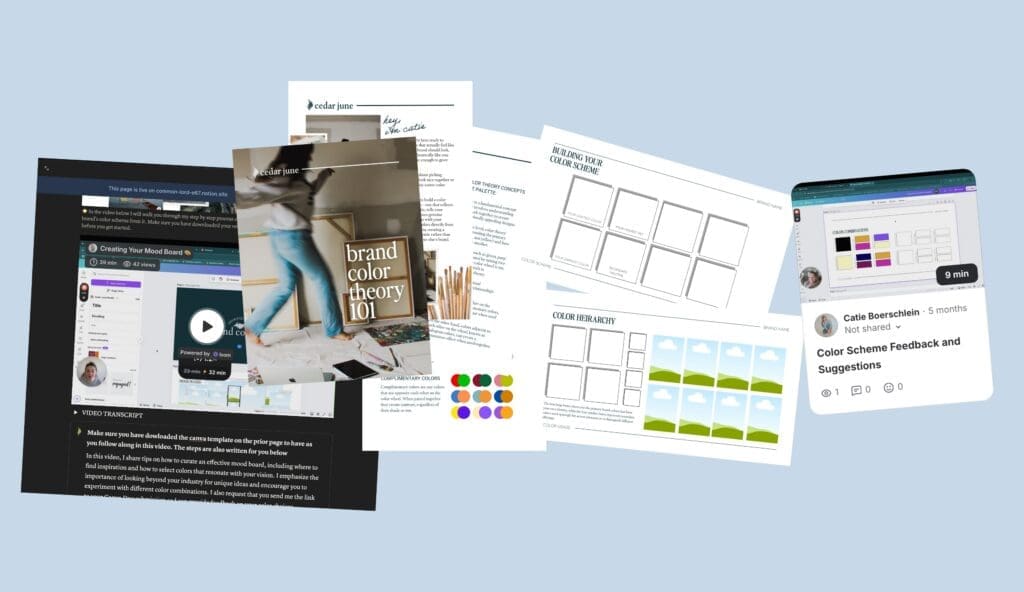
Want The Complete Method? I Built You A Brand Color Toolkit
If you want the complete step-by-step process I use with clients—including the Canva template where you’ll actually build this, a 30-minute video walkthrough showing you every decision I make, and two rounds of personalized feedback on your palette—The Cedar June Brand Color Kit walks you through:
- Brand color theory (8-page PDF that explains how to make colors work together without the art school jargon)
- Customizable Canva template (where you create your mood board, pull colors, and test combinations)
- 30-minute video tutorial (watch me build a complete brand color scheme from scratch for a mock brand inspired by a road trip to northern Maine)
- Two rounds of expert feedback (send me your colors before you start + your final palette after completion, and I’ll tell you what’s working and what needs adjusting)
It’s pay-what-you-want starting at $5 because I genuinely believe this information should be accessible. You pick what feels fair.
Most people spend 2-4 hours working through it—an afternoon or a weekend, depending on how much you want to iterate. And you’ll walk away with brand colors you actually love & understand how to implement.
Get the Brand Color Kit here →
Want me to just design your brand colors & identity for you?
July 20, 2026


behind the brand
Behind The Brand is a weekly newsletter for solopreneurs and small business owners navigating the ongoing reality that their brand needs to evolve—whether they’re working with a DIY setup, in the middle of a rebrand, or maintaining an established brand through business pivots.
whether you're working with a DIY setup, in the middle of a rebrand, or managing an established brand through business pivots. If you love learning about the why behind brand design and want practical, actionable strategies to help you own your personal brand and feel confident marketing it—because you understand not just the what, but the how and why—then this is for you.


The Cedar June Brand Color Kit
PDF guide, canva template & tutorial
your brand.
2d Design Masterclass
learn the design basics that will help you make the most of your brand id & save time in canva
your brand.


Chief Creative Officer Week FREE framework
get more done for your brand in 5 days than you have in the last 5 months
Whether you're launching, rebranding, pivoting, or just ready to finally love your brand—here's how we can create something that celebrates who you really are while strategically growing your business.

Not sure where to start?
Book a disco call (that’s discovery call, but more fun) and we’ll figure out what makes sense for where you are right now.


Studio Sessions: WEEK LONG REBRAND STRATEGY SPRINTS
Perfect when you need strategic guidance on what's next. Sometimes you just need to brain-dump your brand overwhelm with someone who gets it. In 60 minutes, we'll tackle whatever brand challenge is top of mind—from website strategy to visual direction to figuring out your next pivot. You'll walk away with a clear strategy and the confidence to move forward.

Brand Brushstrokes: Custom Brand Identity + Illustrations

For when you’re ready to show up as your whole, multifaceted self. Stop second-guessing every design decision and get a comprehensive brand package that marries your personal and professional sides. Through custom illustrations and strategic brand development, we’ll create a one-of-a-kind, instantly recognizable brand and the guidelines you need to actually use it.


The Signature Site: Custom Website Design Through Visual Storytelling
When your business has outgrown your website. This done-for-you website design takes you from strategy through site launch. Together we build a website that screams you—where the visual story works with your copy and content, creating a site so aligned it’s like you put your signature on it.
Brand & web design services
BRAND COLOR KIT
BRAND & DESIGN BASICS
BRAND IDENTITY
ILLUSTRATIONS & ICONS
BRAND PIVOT STRATEGY
WEBSITE & SALES PAGE DESIGN

