
THE cEDAR JUNE BLOG
Note To Self
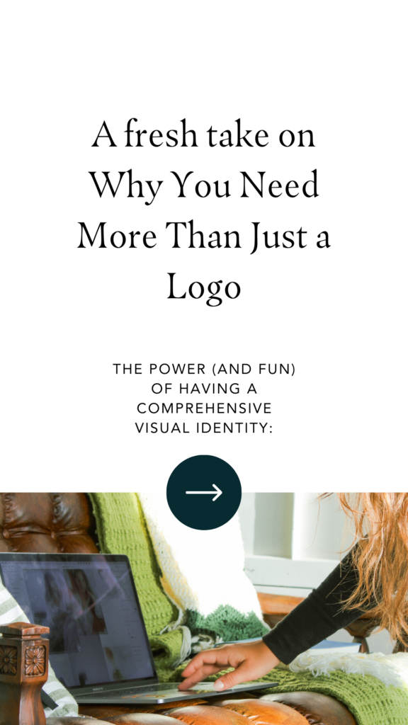
Why your logo is a waste of money


And other advice I probably shouldn’t give you as a brand & logo designer
Your Brand’s Identity is made up of the different elements that your audience subconsciously identifies it with. Most people think that your brand’s identity is defined by it’s logo (when, in my opinion, that isn’t even the most important part). Instead, your brands visual identity consists of the colors, fonts, imagery, design elements, and your logos – (but more importantly) how they work together to create a visual and lasting impression on your audience.
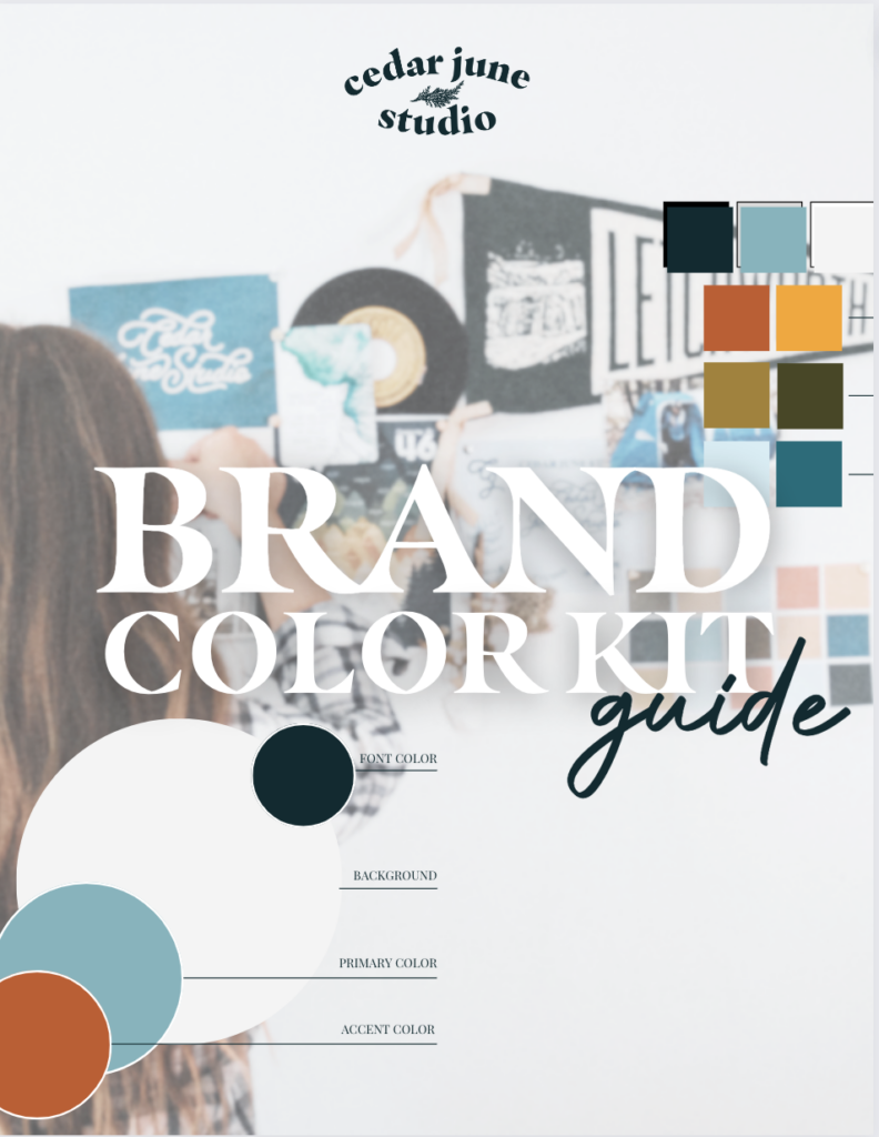
The power (and fun) of having a Comprehensive Visual Identity
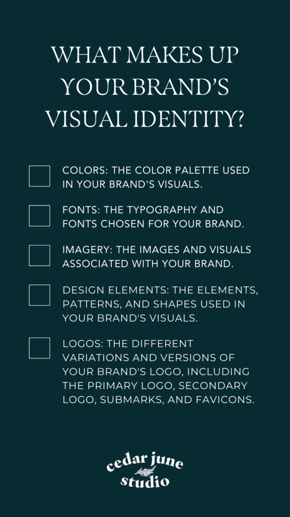
Your brand’s visual identity is so much more than a logo – it’s also…
- Colors: The color palette used in your brand’s visuals.
- Fonts: The typography and fonts chosen for your brand.
- Imagery: The images and visuals associated with your brand.
- Design Elements: The graphical elements, patterns, and shapes used in your brand’s visuals.
- Logos: The different variations and versions of your brand’s logo, including the primary logo, secondary logo, submarks, and favicons.
Unpopular Advice from a Logo Designer
One of the most common misconceptions people have about starting a brand and business is that you need a logo to start. So, in this blog post, we will talk about your brand’s visual identity, how you can develop it on your own, and when to invest in working with a brand designer.
Why investing in a logo is a waste of money.
The purpose of your logo is to create a recognizable and identifiable visual representation of your brand. Where entrepreneurs tend to get tripped up about their logo is in thinking it is the most important part of their business.
A well-designed logo does not evoke emotions or build trust with your audience (even though AI tried to tell me it did).
A well-designed logo is only one piece of your visual brand. Think about the last digital entrepreneur you connected with on Instagram. Do you know what their logo looks like?
Chances are you don’t (unless it’s a really bad one).
Instead, you visualize their overall vibe – if they use specific colors, you will remember those – you definitely can somewhat picture their face, and that brand’s impression in your mind is an overall aesthetic – not a specific logo.
So why even care about your logo – if it’s not what someone really remembers? Why invest in a logo at all?
The answer is – don’t invest in a logo; invest in a visual identity.
You are the most memorable part of your brand’s visual identity (not your logo)
The Power of Developing Your Personal Brand
The most memorable part of your brand is you. If you want people to invest in your services, work with you 1:1, trust you to teach them something in a course, or do all of the above – don’t you think you should allow them to get to know you first?
Building your personal brand does not make you an influencer. In fact, building is a weird word to use to describe it all – because it infers that you are creating something that isn’t there. Instead – developing your personal brand is more like unearthing and sharing of all the little things that make you, you.
Infusing your personality, values, and story into your brand’s visual identity creates an authentic connection with your audience, allowing them to resonate with your brand on a deeper level.
Why you need more than one logo:
If someone asks me to design just one logo, I refuse. One logo will never set your brand up for success. Which, probably has you wondering – if one logo doesn’t leave an impression, why would I need to pay someone to create more than one?
For one, having multiple logos is just more fun.
Who doesn’t daydream of having their logos on stickers, crew necks, baseball hats, and business cards?
But also, no logo does it all. Here’s a quick “meat and potatoes” breakdown of the different logos your brand quotes on quote “needs.”
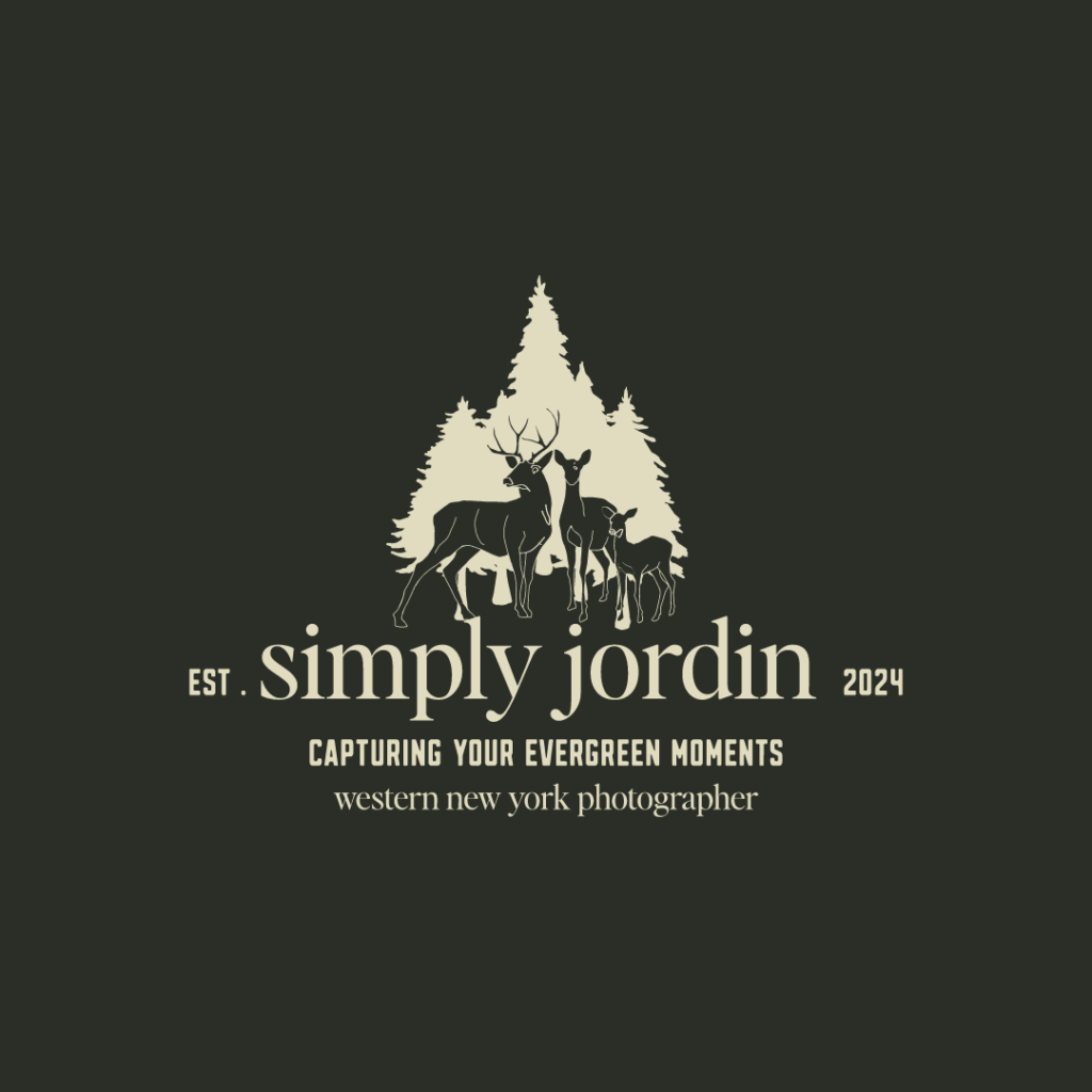
#1. Your primary logo:
I describe this to my 1:1 clients as your “first-string quarterback.” It is the star of the show, or the face of the “team,” so to speak.
Your primary logo is the one you will use the most often in your brand and will include the most “information,” like a tagline, location, and other copy to give context to your logo’s name.

#2 Your secondary logo:
Where you can run into trouble with your primary logo is that, in certain contexts- you can’t read all that extra information.
That is where your secondary logo comes in. Your secondary logo is based on your primary logo but is a more simplified version. This is like a “second-string quarterback” – it does the job when the primary can’t.
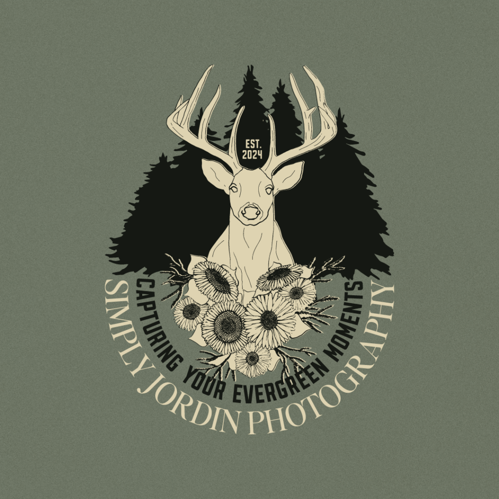
#3 The Submark:
Sub-marks are scaleable designs that fit smaller spaces where your other logos won’t work.
Sub-marks are typically badges or letter marks (see example). They are a fun way to get creative with your brand and can be used as patterns, design elements, and merchandise like stickers (my fave).

#4 The favicon:
Have you noticed we are getting smaller and smaller here? The favicon is the most scalable element in your logo suite.
A Favicon can be any illustration or letter form as long as it is simple enough to be identifiable as an icon. You can also use your favicon as a design or brand element on merchandise.
How to Set Your Brand Apart
For all the girls who don’t want their brands to look like just another Canva template
Here is your reminder that we are all being bombarded by imagery 24/7/365
55% of brand first impressions are visual – Finding little ways to set your brand apart can help you get someone’s attention and connect with them.
Here are some of my favorite ways to help your brand stand out
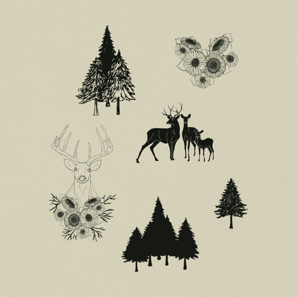
Invest in a visual identity that includes custom Illustrations:
Hand-drawn illustrations add a layer of visual interest to your brand, and they aren’t just for brands with physical products and packaging. Here are 3 ways you can utilize illustrations for your brand
- On your website – illustrations can be used as design elements and icons on your web pages.
- In Merch and print collateral, who doesn’t love a good sticker? Or, dare I say, crew neck? Illustrations can be used on merch and business cards and give you opportunities to be creative.
- Incorporate illustrations into social media posts and marketing materials, reinforcing the brand’s visual identity and making the content more engaging.

Create Conceptual Brand Photography:
Another way you can get creative with your Brand’s visual identity and help it stand out is to combine your brand photography with your personal brand to create an authentic-feeling face for your brand.
Don’t stop for Starbucks: We’ve all seen the Macbook, blazer, and Starbucks shot. And I’m sorry if I’m calling you out. It is not memorable. Lean into your personal brand and, if possible, work with a photographer to create a concept for your next brand shoot that aligns with your brand’s values, creative direction, and messaging.
To add a personal touch to your brand photography shots, consider including your favorite books, candles, coffee cups, desk trinkets, and other items that reflect your unique style and personality. You can showcase your favorite artwork, plants, or even a cozy blanket to create a warm and inviting atmosphere. By incorporating these personal elements, you will make your brand photography more visually appealing and create a deeper connection with your audience, conveying a sense of authenticity and relatability.
Remember, your brand photography should reflect your brand’s personality, values, and target audience. It should tell a story and evoke emotions that resonate with your viewers. By creating a strong brand photography direction and utilizing stock photography effectively, you can set your brand apart and make a lasting impression on your audience.
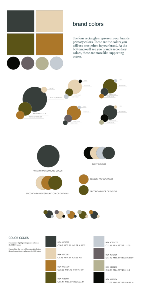
Curate your Brand’s Color Scheme:
Color is the cheapest, fastest, and most effective way to set your brand identity apart. Consumers are 81% more likely to recall a brand’s color than to remember its name (Reboot).
Did I save the best for last? Maybe?
Color sets the stage for everything else & can completely change the feeling of your website, logo, and brand.
Click here to read The Ultimate Guide to Designing Your Brand’s Color Palette.
When used correctly, your brand colors increase brand recognition by up to 80% (Loyola) & their treatment carries over across multiple platforms. You use brand colors from your email to your social graphics.
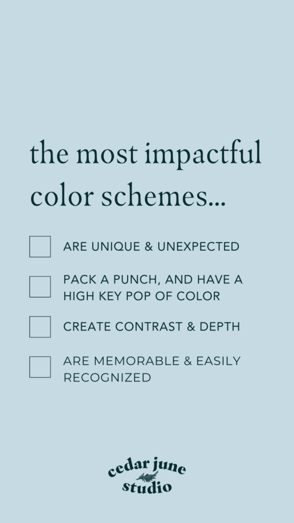
The most impactful color schemes
- Are unique & don’t feel done
- Pack a punch and have a high-key pop of color.
- Create contrast & depth.
- Are memorable & easily recognized
Signs it’s time to work with a Brand Designer
- You want your brand identity to look professional but lack the design skills to do it yourself.
- You wanted to start your brand like yesterday, and you need your brand’s colors, logos, and fonts to get to work.
- You’ve DIYed your brand in the past, but it never felt intentional or cohesive.
- You & your brand have grown & changed – you need its identity to do the same.
Remember, investing in a brand designer is an investment in your brand’s long-term success and recognition. Working with a Brand Designer can help you create a comprehensive & strategic visual identity that accurately represents your brand’s values, personality, and unique offerings.
Developing a comprehensive visual identity for your brand goes beyond just having a logo. It involves creating a cohesive and memorable visual experience for your audience. By considering elements such as colors, fonts, imagery, and design elements, you can set your brand apart and make a lasting impression.
Your personal brand is a powerful asset that can help you connect with your audience on a deeper level. Infusing your personality, values, and story into your brand creates an authentic connection that resonates with others.
While a well-designed logo is important, it is just one part of your visual brand. Your visual identity consists of various elements that work together to create a unique and authentic brand experience. Utilizing illustrations, brand photography, and strategic use of color can help your brand stand out and leave a lasting impression.
If you feel overwhelmed or lack the design skills to create a comprehensive visual identity on your own, consider working with a brand designer. They can help you develop a strategic and visually appealing brand that accurately represents your values, personality, and offerings.
Wanna do this thing together?
Click here to apply to work with Cedar June 1:1 to design & develop your brand’s visual identity.
Love this Blog? Subscribe to my newsletter, The Weekly Drop-In, to get the why behind brand design delivered straight to your inbox each week.
2/11/2024


COMMENT LOVE