THE CEDAR JUNE BLOG
Brand Design
BROWSE BY category
Planning
Marketing
Entrepreneurship
Brand Strategy
Brand Design
Websites
read
On May 2nd, Did You Hear About Kitty Karr? officially went on sale. The same day Crystal Smith Paul’s novel was announced as the May 2023 main pick for Book of The Month and the May 2023 pick for Reese’s Book Club. Of course, Crystal’s determination, discipline, and story helped to make that happen. But her work on building a brand that she Is proud of, that looks, feels, and sounds like her. – that gives her the confidence to promote her book in her aesthetic and show up on Instagram as the writer, creator (and, did I mention, amazing human) she is.
The crystal that I started working with almost two years ago was still getting used to the idea of needing to show her face on Instagram. Crystal, an e-commerce writer, was embarking on her debut book, “Did You Hear About Kitty Karr?” with Henry Holdt & Co. She aimed to establish her authorship and online presence, entrusting me with her brand and website design, excluding her pre-existing logos by Lauren Sedmak. Now, personal brand (and tripod) in hand, she is creating content to promote her book in collaboration with her publisher, other authors, and more.
Our original goals were to:
- Create the personal brand and website for Crystal Smith Paul, the author
But the challenges in building her brand were to:
- Include visual themes from the book.
- Leave room for future books and creative endeavors to “join” her personal brand.
- Not give away anything from the book.
Not to mention, I had to complete all of this before reading the book. You’d be surprised to learn that Crystal and I were building her brand for 18 months before I could receive an Advanced Readers Edition.

The Art of Building a Strong Personal Brand for Writers
To start the branding process, I employ strategy. A customized Brand Strategy Questionnaire helped me understand Crystal as both a person and writer. Through questions, I learned about her brand vision and what distinguishes her books. Her education at Spellman, UCLA, and NYU, along with the influence of the women who came before her, shaped the characters in “Did You Hear About Kitty Karr?”.
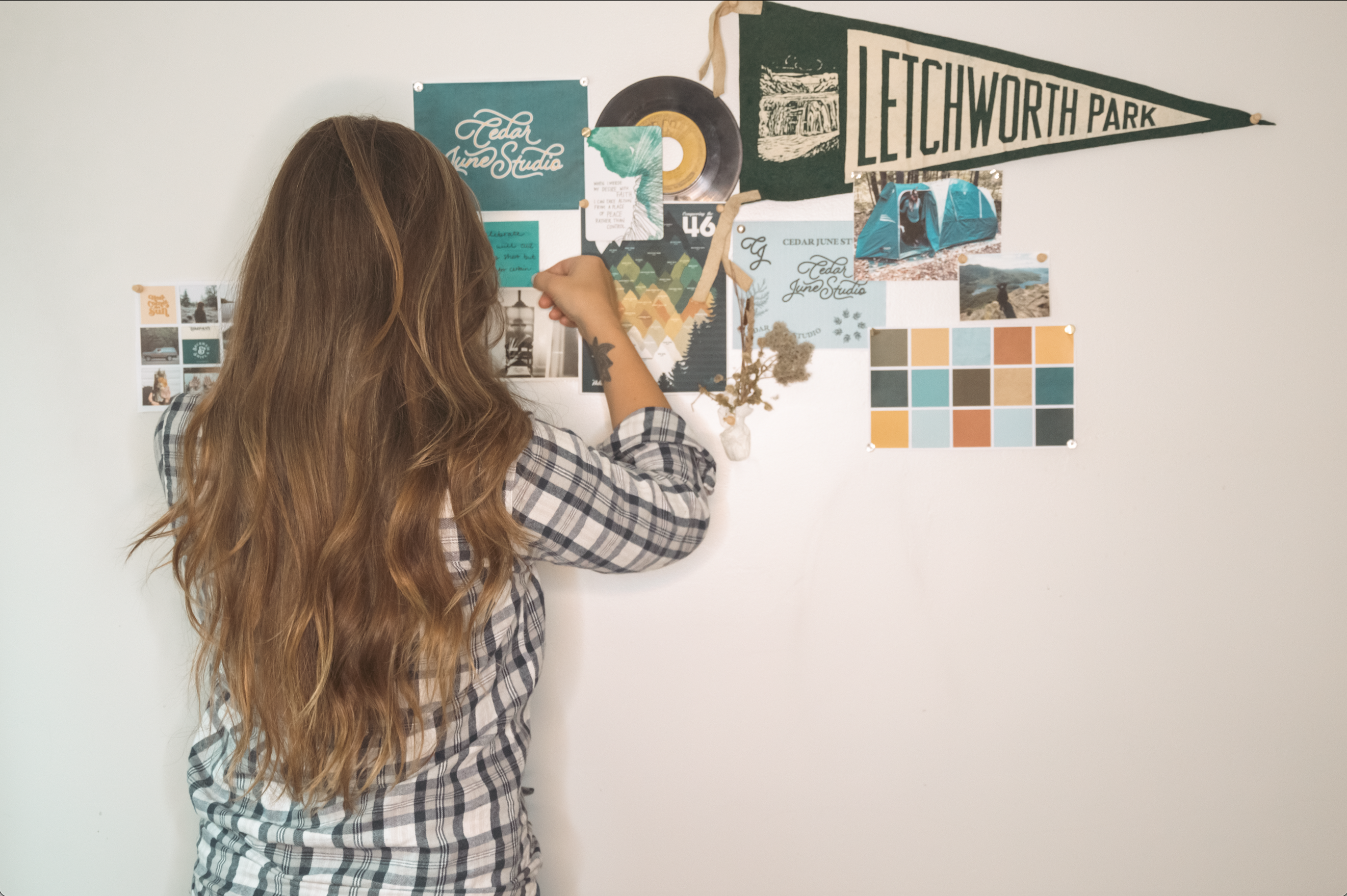
We bonded over our love for mood-boarding on Pinterest (we share 11 boards!). Collage, digital art, and juxtaposing the old and new inspired our creative direction, aligning with the multi-generational theme of Kitty Karr.
Building a Brand Identity
We compiled a master list of Kitty Karr story items and icons. Crystal drew inspiration from both her home state of North Carolina, and California, where the story is set. Her brand identity incorporated visual elements from both places.
I created two initial visual design concepts, narrowing down our favorite elements and colors. Our final creative direction was determined.
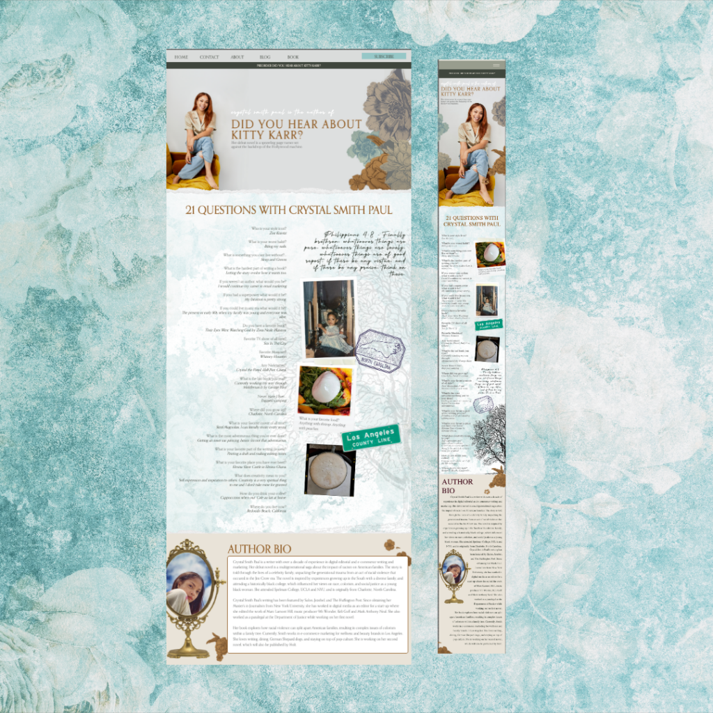
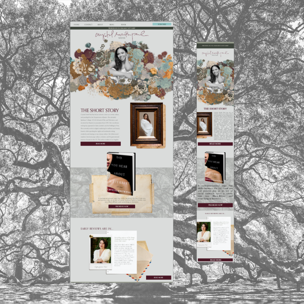
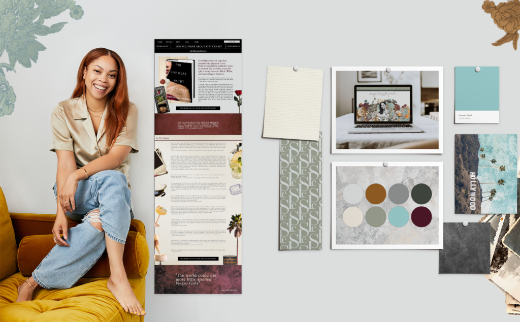
The website featured a collage-inspired user experience with significant visuals from the book. Using Photoshop, I extracted shapes from vintage wallpapers and combined them with Crystal’s headshots and brand photos.
We chose Showit to build the website for complete creative freedom, allowing us to design an artistic composition with hidden iconographic clues known only to Crystal.
Amplify Your Author Brand: Building and Managing a Strong Online Presence
We brought in Kendall Hackett and her team from Kendall Media Co. to kickstart Crystal’s new Instagram account. Our main challenge was establishing her brand on IG without revealing book details.
As Crystal’s brand manager, we collaborated to create lifestyle and writing-related content for her Instagram. Establishing her brand presence beforehand allowed her to practice filming and create promotional content with ease when the book launched.

Introducing Our Brand and the Book: A New Chapter Begins
Getting my hands on the book was a thrill. Once I started reading, I was completely captivated, unable to put it down. The story had me hooked, and I eagerly devoured all 416 pages in just three days, eager to uncover what would happen next.
Once Advanced copies went out, reviews started to flow in from renowned authors like Taylor Jenkins Reid, who wrote The Seven Husbands of Evelyn Hugo, and Daisy Jones and the Six.
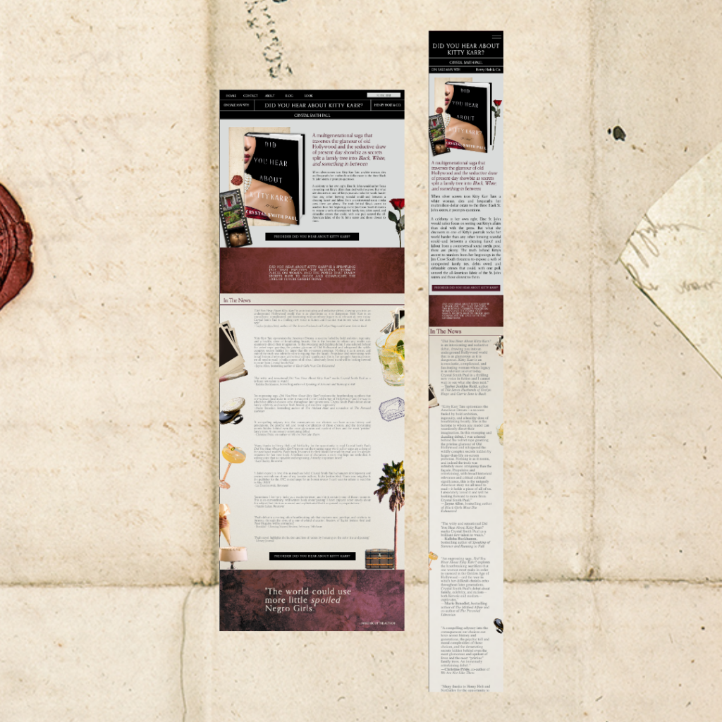
I designed and added the book page for Did You Hear About Kitty Karr and added it to her website in a final push before a presale.
I created branded email templates (opting to work on Flo Desk) that Crystal utilized to announce her new website and that the book was on presale. But the bulk of our promo efforts went in on Instagram.
Creating an Instagram-Worthy Author Brand: Behind the Scenes of Crystal Smith Paul’s Success
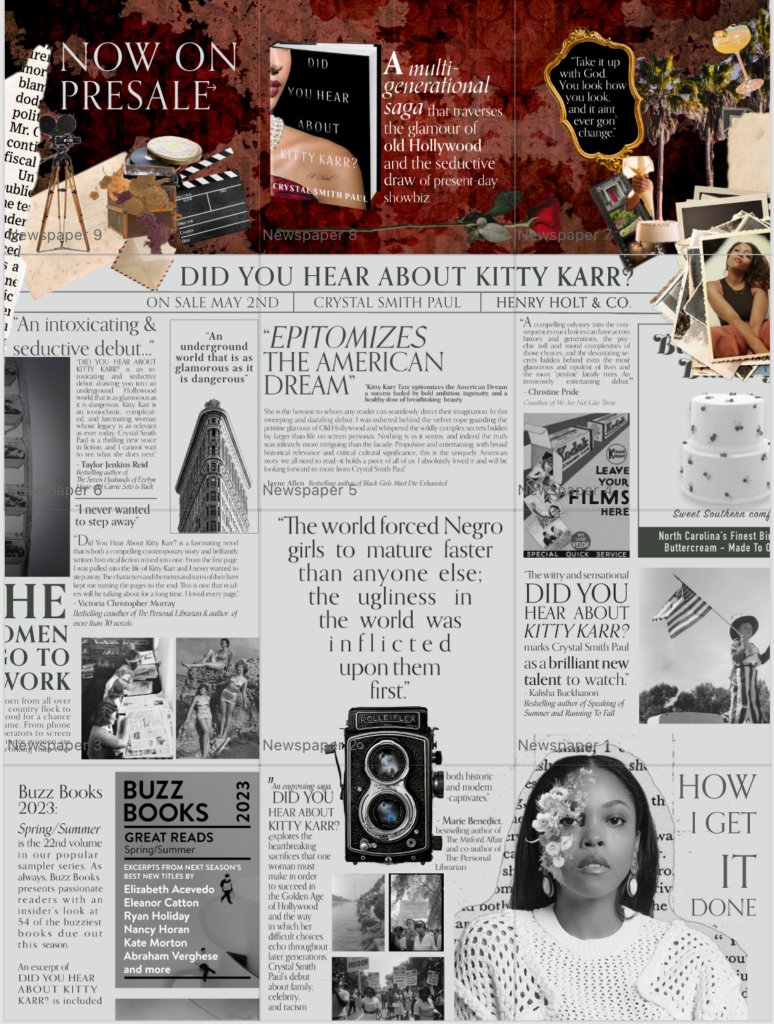
We used the pin feature to create “banners” out of Crystal’s top three Instagram posts. The first version of this banner announced that Did You Hear About Kitty Karr? was on presale; the following nine post covers to combine on her feed to look like a newspaper. Each post featured a review, and we carefully added clues to the book’s theme with the imagery we used.
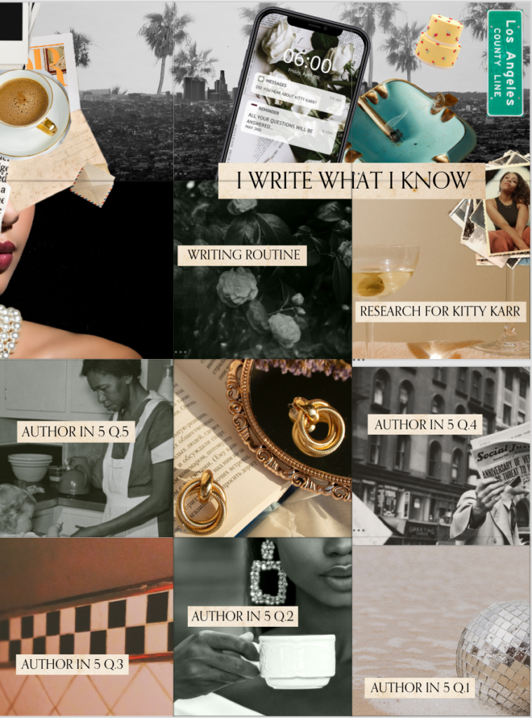
Playing off the duality of the multi-generational story of Kitty Karr, our next banner and composition was slightly more modern, featuring notifications on an I phone and full-color photos.
Finally, it was time for “Pub Day”! I created a final series of post graphics that read “Out Now” that you can’t miss on Crystal’s feed. After a quick comb through her website and switching a few buttons over, we were “done” for the most part. Now it was time to sit back and see what happened with the book.
Did You Hear About Kitty Karr?
That leaves one question left – what’s next? Since the book only went on sale yesterday – Crystal is still riding the “Pub Day” high – with Tuesdays massive announcements, her followers continue to climb.
This moment is what we have been working toward. Crystal knew that establishing her brand ahead of time – would pay off once she had the spotlight. Now she gets to soak it in and celebrate until it’s time to get to work on the next book.
category title
read more →
May 3, 2023

social, inspo & sound →
subscribe
BLOG
RESOURCES
BACK TO TOP ↑
spam is so not on brand, unsubscribe at any time
CONTACT
ATTICA - NEW YORK | POWERED BY SHOWIT | SITE DESIGN BY CEDAR JUNE STUDIO
home

