
THE cEDAR JUNE BLOG
Note To Self
The Ultimate Guide to Designing Your Brand Color Palette


Your Brand Color Palette plays a vital role in your brand’s identity. It has the power to evoke emotions in your audience, communicate your brand’s messages, and create memorable experiences for your clients and customers.
Yet too often, i talk to creative entrepreneurs that either
- Don’t know what their Brand Colors are.
- Don’t love their Brands Color Palette
- Waste time and energy choosing new colors each time they design something in Canva.
- Or all of the above.
But, what if instead you had a set color scheme that you felt on brand for your business?
In this blog post, we will explore the importance of color for your brand and provide a step-by-step guide on how to create a Brand Color Palette that captures your brand’s essence and resonates with your target audience.
Understanding Your Brand and Why Color is Important
While color scheme generators can serve as a useful jumping-off point but they often fail to establish a strong emotional connection to the colors chosen. My approach to color as a designer sets me apart from many other brand designers. I believe in guiding entrepreneurs to curate a color palette that reflects their unique aesthetic and brand identity.
Which bears the question, why is color so important for your brand?
Color holds incredible power to evoke emotions, communicate messages, and leave a lasting impression on your audience. When used effectively, color can shape the way people perceive and interact with you and your brand. Color has the ability to influence your customer’s feelings, decisions, and overall experience with your products or services.
The 5 most recognized Brands in the world are:
- Apple
- Amazon
- Microsoft
- Coca Cola
When you close your eyes and think of each brand, can you see their colors?
- When you think of apple you probably think of milky white, metallic neutrals, and neon pops of color.
- When you think of Google, you think of the primary colors that grace each letter of their logo.
- When you think about Coca-Cola immediately evokes a timeless red and white-combo.
By establishing their brand’s color schemes, these companies have built brand recognition that has become so identifiable that we can think of a brand’s colors by simply closing our eyes.
How to create a memorable Brand Identity
Understanding your brand’s strategy and target audience is crucial in selecting the right colors. Your brand should reflect your core values, mission, and vision. Start by defining your brand’s personality and values. Are you aiming for a bold, energetic brand or perhaps a more soothing and calming presence?. By understanding your audience’s preferences, social and cultural influences, you can choose colors that resonate with them on a deeper level.
Your brand’s color palette should be carefully chosen to align with your unique aesthetic and the personality you want to convey. A strong emotional tie between your brand and its colors can significantly impact how your audience perceives and connects with your brand.
Ultimately, by curating a color palette that aligns with your brand’s unique aesthetic and establishing an emotional connection to those colors, you can create a strong visual identity that captures attention, conveys your message effectively, and leaves a memorable impression on your audience. In the next sections, we will explore the basics of color theory and guide you through the process of creating a brand color kit that perfectly represents your brand.
Understanding Color Theory: From Basics to Advanced Concepts
Color theory is a fundamental concept in design that plays a vital role in creating effective and visually appealing designs. By grasping the basics of color theory, you can make informed decisions about the colors you choose and how they work together to communicate your brand’s message.
The Basics of Color Theory
At its core, color theory involves understanding the primary colors: red, blue, and yellow. These colors form the foundation for all other colors in the spectrum. Mixing two primary colors creates secondary colors like green, purple, and orange.
The color wheel is an invaluable tool in understanding color theory. It visually represents the relationships between colors and provides insights into how they interact. Complementary colors, located opposite each other on the color wheel, create a strong contrast when used together. On the other hand, analogous colors, which are adjacent to each other on the wheel, produce a harmonious effect when combined.
By familiarizing yourself with the color wheel and exploring different color harmonies, such as complementary, analogous, and triadic colors, you can leverage these relationships to create visually appealing designs for your brand.
Advanced Color Theory
Moving beyond the basics, let’s delve into advanced color theory concepts. Colors can be classified into warm, neutral, and cool shades and tints. Warm colors exude energy and vibrancy, while cool colors evoke calmness and tranquility. Adjusting the proportions of the primary colors within a hue can create endless variations. For instance, adding more blue to red results in a cool red, while infusing yellow into green makes it a warm green. This flexibility allows you to explore different shades and tints to find the perfect representation of your brand’s identity.
Remember the viral striped blue and black dress?
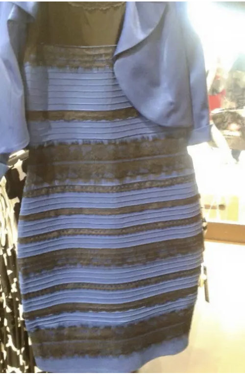
Is That Dress White and Gold or Blue and Black?
Our perception of color depends on interpreting the amount of light in a room or scene. When cues about the ambient light are missing, people may perceive the same color in different ways.
Various factors, including the surrounding environment, can influence our perception of color. The same color can appear different when placed against different backgrounds. Traditionally trained painters often prime their canvas with gray or brown to observe the true color as they apply it. Similarly, using a consistent shade of gray as the background can provide the most accurate representation of each color in your color kit.
Achieving a balance between high-key and low-key colors is crucial when creating a color scheme. The high-key color is the one that stands out the most, drawing attention and acting as the “pop of color” in your design. Too many high-key colors can be overwhelming (think Lisa Frank – but not in a good way), while a scheme dominated by similar low-key colors can appear muddy.
Remember, color theory is not just about aesthetics; it’s about understanding how colors can influence perception, evoke emotions, and enhance your brand’s message. By applying the principles of color theory, you can elevate your designs and create a visually captivating brand identity.
Creating Brand Mood Boards
I recommend you create two kinds of visual mood boards for your brand. A Brand Vision board – that you can add to over time and use as a source of inspiration. And a more curated mood board for your brand’s identity. I like using photos and objects fro life, visual search engines like Pinterest, and stock photo websites like Unsplash to build mood boards for my business and my client projects.
Here are some ideas to inspire your brand vision board:
- Include places or spaces that hold personal significance to you.
- Collect icons or imagery that resonates with your values and brand personality.
- Add art, photography, or anything that evokes strong emotions within you.
- Seek out typography or hand lettering inspiration to enhance your brand’s visual identity.
- Explore examples of logos and illustrations that inspire and align with your brand.
Feel free to check out the Cedar June Studio Pinterest, where I’ve curated boards for each category listed above to help you get started.
Once you have created your brand vision board, take some time to scroll through it and save your favorite images. Then, utilize a design tool like Canva to upload and arrange these images into individual frames on your brand identity mood board. Don’t hesitate to explore Canva’s library of objects and photos to add additional elements and enhance the composition further. Set the mood for this creative activity by curling up with your favorite cup of coffee and turning on your Spotify “on repeat” playlist. This should be a fun and intuitive process that fuels your creativity.
Choosing Your Brand Colors
Selecting the perfect colors for your brand should be a creative, intentional process. Here is the exact process I use to create brand color palettes for my 1:1 design clients inside my brand design containers.
STEP ONE
I start with a Brand identity mood board, at least 30 gray circle shapes, and a color picker tool (you can do this in AdobeXD/Illustrator/Photoshop and Canva)
STEP TWO
Selecting a blank shape and the color picker tool, I move the tool around the images on my mood board, “picking out” individual colors that I like and feel on brand.
STEP THREE
Once I’ve created 30 or more color swatches, I group like colors together.
STEP FOUR
Now, it’s time to make decisions. Choose the colors that truly resonate with your brand and delete the ones that don’t align with your vision. Aim to narrow down your selection to a range of 8 to 10 colors. This ensures that your color palette remains cohesive and memorable.
STEP FIVE
Establish the foundation of your color palette by designating your darkest color as your brand black. Then, select your lightest color and make it your brand white. Also, choose a neutral color representing the mid-range of your color scheme and designate it as your gray brand. These three colors will serve as your brand neutrals, providing a consistent and versatile base for your visual identity.
STEP SIX
From the remaining colors in your color picker, identify two warmer colors and two cooler colors. These colors will bring depth and variety to your palette. Select 1 to 2 colors that act as neutral bridges, seamlessly connecting the cool and warm tones in your color schemes.
STEP SEVEN
Now that you have chosen your primary colors, it’s time to assign them specific roles. Your lightest primary brand neutral becomes your primary background color. Choose your most vibrant color and make it your primary pop of color, adding excitement and capturing attention. The other two brand neutrals become your primary brand colors (and secondary background options). Finally, select another color from your palette and designate it as your third primary brand color. All remaining colors will serve as your secondary brand colors, providing flexibility and complementing your primary colors. Assigning roles to your brand’s colors helps you to create better assets and represent your brand consistently. You can also explore analogous color schemes and how different shades and variations of your colors can work together harmoniously.
Learn better on video? There’s a whole tutorial on how to do this inside the Canva Color Kit
Conclusion
Creating a brand color scheme is crucial for building a strong and recognizable brand identity. By understanding your brand, learning the basics of color theory, creating a mood board, thoughtfully choosing your brand colors, and establishing brand guidelines, you can create a visual identity that resonates with your target audience and effectively communicates your brand’s personality and values.
Remember that colors have the power to shape perceptions, evoke emotions, and leave a lasting impression. So, invest the time and effort in crafting a brand color kit that authentically represents your brand and sets you apart from the competition.
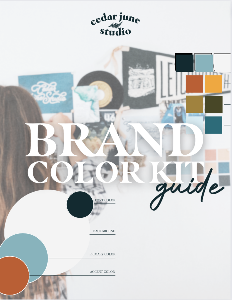
Design Your Brand Color Palette
To ensure consistency in the use of your brand colors, it’s essential to establish brand guidelines. Determine how and where your brand colors should be used across various platforms, including your website, social media, marketing materials, and packaging.
That’s why I created the Cedar June Brand Color Kit. This free resource breaks down the process of creating one-of-a-kind brand color schemes in a step-by-step PDF guide and customizable Canva template. It provides everything you need to define the colors that represent your brand and use them effectively.

6/27/2023


COMMENT LOVE