
THE cEDAR JUNE BLOG
Note To Self
3 Easy Ways to Create a Cohesive Visual Brand


One thing that overwhelms entrepreneurs the most when it comes to this whole “branding” thing is that your Brand is everywhere.
It’s woven into the fibers of almost everything you do in your business in a strategic sense – but then you also need to switch gears and include it in everything you do from a visual sense.
When you run your business online – you have more than one “storefront,” so to speak.
You’ve got your website – the main space and place where transactions happen- but in a sense. You’ve got a lot of “pop-up shops”.
Your Instagram, email marketing platform, and any other 3rd party client-facing integrations (aka. other online tools your clients see and are a piece of their experience within your brand) are some of the most common examples of these “pop-up shops.”
Places online where you are “doing business”.
Your goal, as a digital marketer, is to create a branded experience for your clients that feels seamless no matter what platform you are interacting on.
But, like most things in online business, that is easier said than done.
Here is how I would create a seamless cross-platform client experience if I were starting from scratch.
Step One: Commit to a color scheme
Your colors are one of the simplest ways to create brand recognition (when the viewer recognizes your brand based on its visual appearance) across multiple platforms.
When It comes to color, I believe in being bold and taking risks. Do something a little unexpected for your industry, and don’t be afraid to commit to a bright pop of color that does just a little more to set you apart, stop your scroll, and catch your eye again in the future.
Almost every platform allows you to choose your brand colors by keying in the specific HEX codes.
If you don’t really have specific Brand Colors or don’t know how to make the most of them, you can check out my free brand color guide at the bottom of this blog.
Step Two: Stick to your fonts
Like color, fonts contribute to your brand’s feel and aesthetic. Also like color, there are so many fonts to choose from. Talking about fonts and font pairings could be an entire post in itself, so for the sake of this newsletter, I’m gonna stick to the basics.
✔︎ Legibility is key here; if they can’t read it – your words won’t matter. Period.
→ Limit your brand fonts to three different families: a decorative font, your logo font, and something that can work in body paragraphs. This is a great place to start.
→ Once you choose your fonts, stick to them as closely as possible – some platforms might not let you upload your custom font – if that is the case, choose something as close as possible!
Step Three: Brand Photography
When it comes to Brand and Web Design – I would consider myself a pretty photo-heavy creator.
A picture paints a thousand words, right?
Brand photography is another easy way to carry your brand’s aesthetic from one platform to another therefore creating a seamless client experience.
If you’ve been around for a while, you already know that I’m a huge fan of creating your own content, whether that is hiring a photographer or DIYing your content day.
You can also download or purchase stock images to fill gaps along the way. Some of my favorite places to find stock include Unsplash and Canva.
To create cohesion, especially if you are mixing your own brand photos with stock, think about your brand’s overall aesthetic and creative direction. Choose Brand photos that fit your vibe.
Consider adopting an editing style or filter to replicate colors and tones from your own photos to match stock, add opaque layers of your brand colors, or overlay textures to create a comprehensive visual content bank that doesn’t feel like it is someone else’s stuff.
💡Remember: The goal is to create a recognizable image of your Brand that can live subconsciously inside the head of your ideal client. The more consistent you are in delivering your brand on a visual & strategic level. The more you will earn that person’s trust
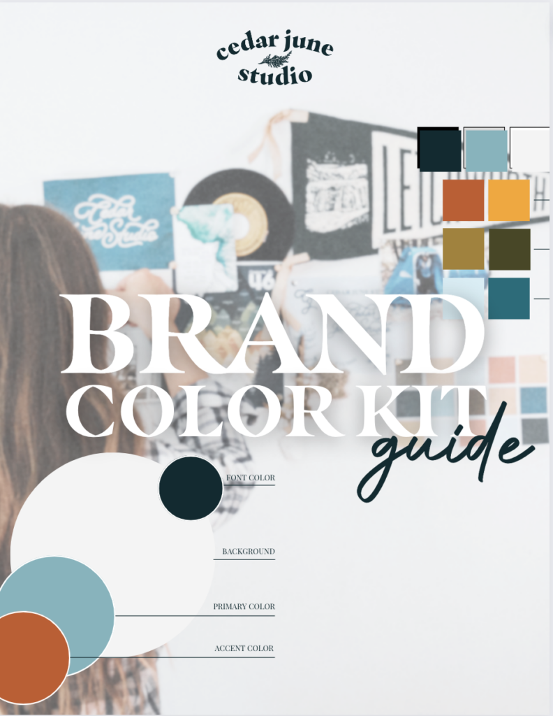
Need help finding the colors that speak to your Brand?
Click here to download the Cedar June Brandd Color Kit & Guide
A PDF guide & fully customizable Canva Template
12/11/2023


COMMENT LOVE